
v1.0 covers color, typography, and brand guidelines. Everything after it gets built on top of an 8pt grid with zero room to bend.
Built for expert eyes, including the AI's.
Nexular's design system needs to scale across every future page and prototype without inconsistency creeping in the moment I'm not the one building it by hand. As the lead on this, I own v1.0: the color system, the typography scale, and the brand guidelines the rest of the system will build on. Just as important as any of that is the operating discipline underneath it — an 8pt grid with no exceptions, autolayout required on every frame, zero absolute positioning anywhere. It has to be strict enough that Claude Code, working as an AI design partner fed the base file section by section, can build whole sections on its own without a single value drifting off grid.
- An AI partner scales the work, and it scales every small mistake right along with it — it will repeat the same off-grid value fifty times in a row if the rule stopping it isn't airtight
- The audience reviewing this system is expert and international — sloppy spacing or broken autolayout gets caught in a glance
- Most design system documentation gets written after the fact, once nobody remembers exactly why a decision was made
- Every numeric value divisible by 8 — spacing, padding, radius, stroke, no rounding and no quiet exceptions
- Autolayout mandatory on every frame and component, no absolute positioning anywhere in the file
- Self-QA and documentation built into the build process itself, not bolted on after handoff
A system that runs on eight.
Every spacing value, every corner radius, every stroke width traces back to the same 8-point unit — the spacing scale runs unbroken from spacing0 to spacing32, and the four stroke weights used across borders, dividers, and focus rings step from a 1px hairline to a 3px emphasis border on that identical grid. Motion follows the same discipline instead of being invented per screen: six duration tokens from a 100ms instant to a 1000ms extra-slow, paired with three named easing curves — standard, decelerate, accelerate — each one a real cubic-bezier, not a guess. Six shadow levels carry that same restraint from a barely-there hover state up to a full modal overlay, so a button lifting on press and a dialog floating over the page are reaching for the same elevation scale, not two different ideas of what "raised" means.

Five ramps, two layers, one rule.
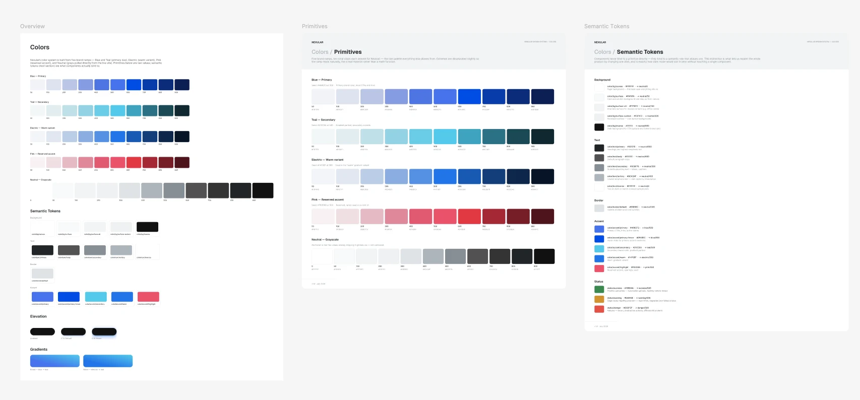
The palette is five brand ramps, each run out to a full eleven-step scale from near-white to near-black: Blue as the primary, Teal as the secondary, an Electric warm variant, Pink held back as a reserved accent, and a neutral grayscale anchoring text and surfaces. None of those primitives ever touch a component directly. Everything a component actually reads is a semantic token instead — background, text, border, accent, and status roles that each alias back to one primitive step, named for what they mean (color/text/muted, color/accent/primary-hover) rather than what they look like. Restyle one ramp and every component built on the semantic layer above it moves with it, without a single one of them being touched by hand.
Wrote the rules the AI had to work inside, not just the tokens it worked with.
The real system design work here wasn't only components and variables — it was a CLAUDE.md operating prompt that defined how the AI partner was allowed to work at all: a role definition, a set of prime directives, and a process it had to run in order on every task, big or small. Tokens got named for what they mean, not what they look like: color/text/muted, never a hex code with a label taped onto it. The one place the 8pt rule was allowed to bend at all was a narrow, explicitly named exception for 4px half-steps, and even that needed my direct sign-off — it was never the AI's call to make on its own.
The system had to be strict enough that an AI couldn't drift from it.
The operating rules had to be tight enough that an off-grid value had nowhere to hide, whether a person or a model built the frame. Running every task through the same seven phases, not just the ones that felt like they deserved it, is what keeps a section built in hour one consistent with a section built in hour forty.
The same constraints, run through real components.
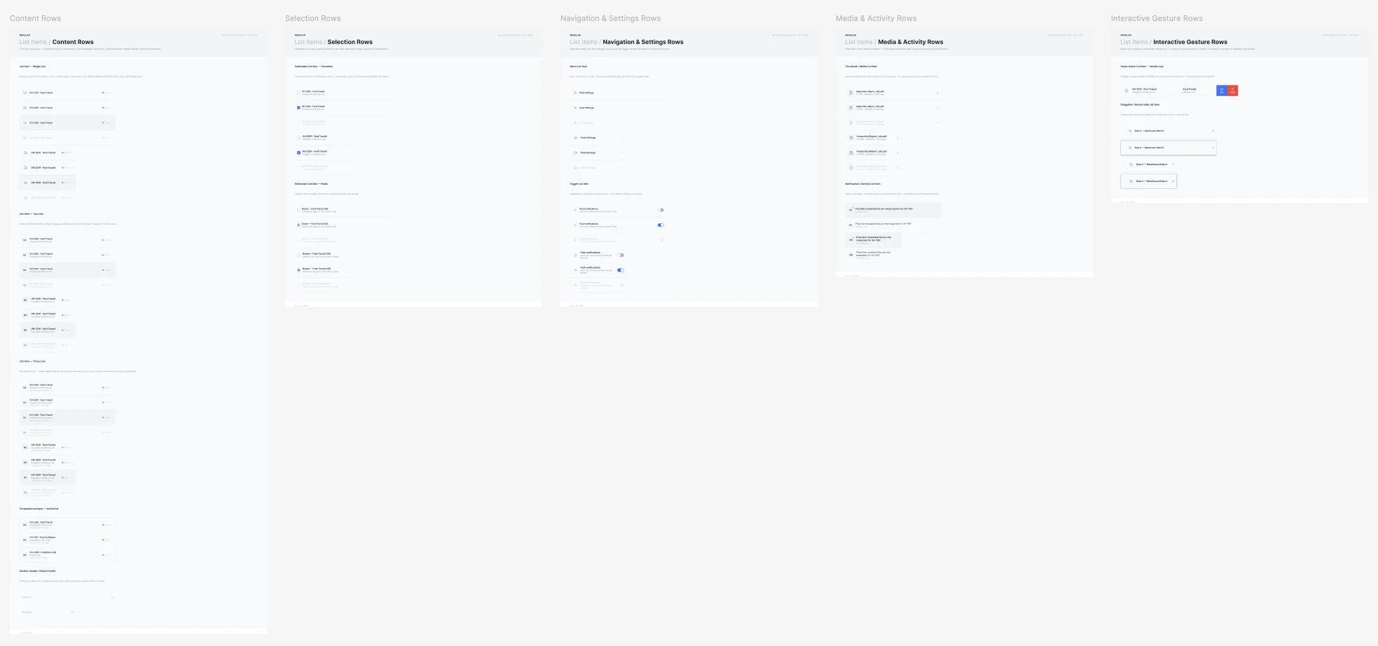
Buttons alone cover seven distinct patterns — filled and outline treatments for the marketing site, tonal and text variants, an icon-only button, an icon-plus-label combination, a floating action button, and a segmented control — each built out across every state and size the system defines, not just the one a screen happened to need first. List items get the same treatment on the product side: content rows in one, two, and three-line densities, selection rows with checkboxes and radios, navigation and settings rows with toggles, media and activity rows, and gesture-driven rows for swipe actions and drag-to-reorder. None of this is tagged into v1.0 — the release stays scoped to color, type, and brand — but every one of these was built and audited inside the exact same constraint set, so nothing here starts the rule-bending v1.0 spent so much effort preventing.

The same seven phases, whether the task took five minutes or five hours.
What v1.0 actually shipped.
- v1.0 shipped — color system, typography scale, and brand guidelines, on a strict 8pt grid with one narrow, owner-approved exception
- Autolayout required across every frame, no absolute positioning anywhere in the file
- Semantic naming throughout, so the system reads clearly to a person, not just the model that helped build it
- Component library already running through the same constraint set — buttons and list items validated end to end, just not tagged into the v1.0 release
- A written operating prompt governs how the AI design partner works — role, directives, and a seven-phase process enforced on every task
- Self-QA and documentation are part of the build itself, not a cleanup pass afterward
- Built to hold up under review from expert, international design audiences, the kind that notices inconsistency on sight